Task 3: Sample design, double page spread of a childrens recipe.
For this task I first looked other example picture
recipes and at how other illustrators had laid out there pages. Here is a few
examples.
My double page spread was on the “Strawberry crown”
Recipe. I picked this because it wasn't too short and wasn't to long and
sounded like something I myself would enjoy making.
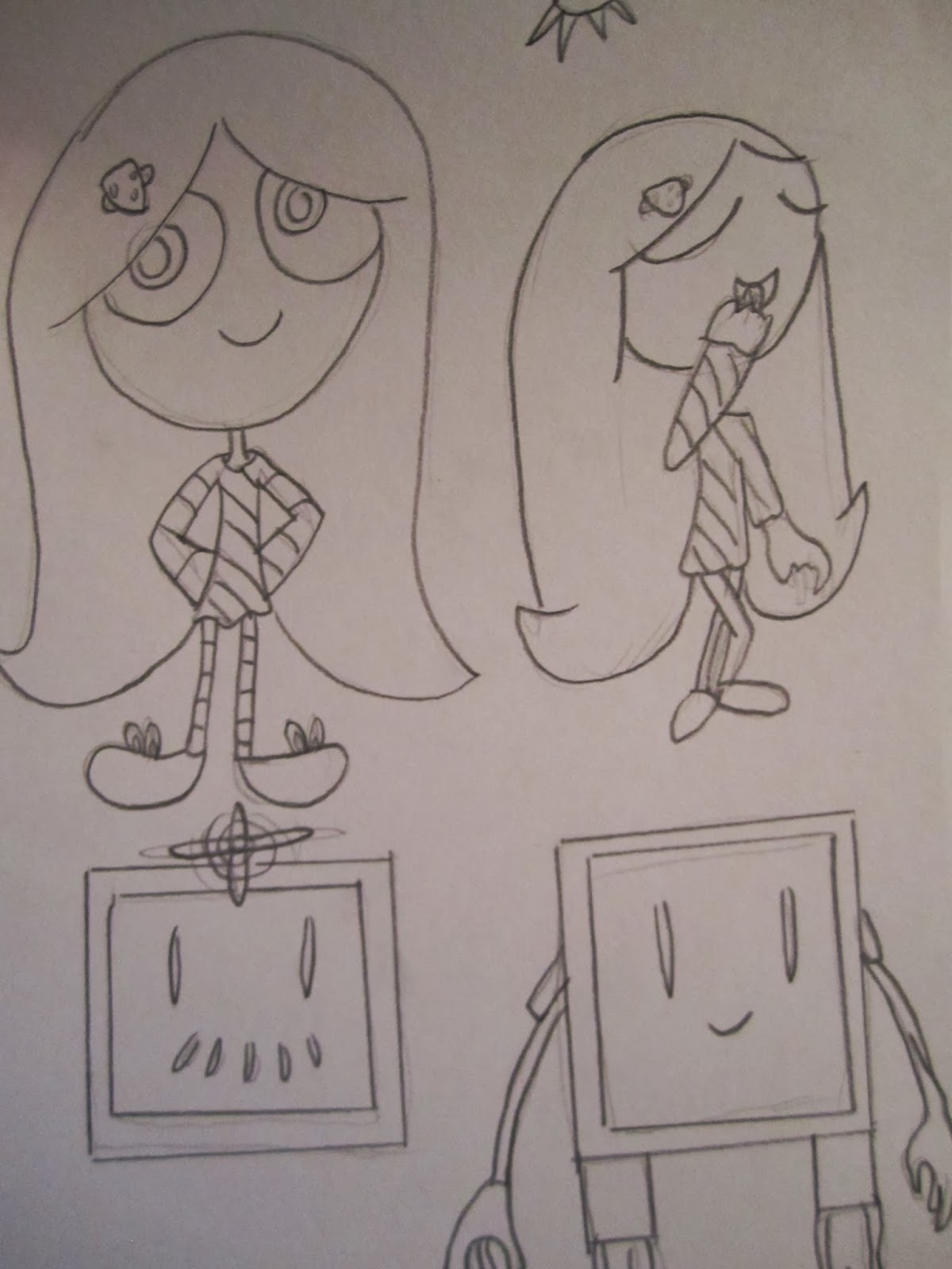
I designed two simple characters to go with the recipe
sheet, a small girl and a floating robot (who would do the harmful tasks like
cutting). The illustrations are simple and fun and do not distract from the
text but instead help the child/children understand what to do.
The text may seem a little small but I usually draw by
hand and then scan redraw it on the computer. So the text would be properly
considered in size/readability when the piece is/would be redrawn.
This also applies to the colour. The colours are a
little dim when done by hand but in the final I would use computer colours that
would be brighter and leave the text more visible.


No comments:
Post a Comment