Friday, 28 March 2014

Recipe Book Visual Research

Recipe Book research 27-28/03/14


Yesterday I went out and looked at some recipe books, looking for interestingly designed books or books that had an extra element to them, especially when the cover was involved.  Here a few that I found.


Made from scratch vegetarian
Love-Food
www.parragon.com/lovefood
 

This book got my attention with its 3D, scratch layered cover. All the dishes were vegetarian dishes and easy to make.

Harmlyn All colour cookbook
200 low fat dishes
Cara Hobday


A small little book with a very formal look about it and easy to carry around

The Australion womans weekly
The Bumper book of kids birthday cakes
Acp books


A large, bulky, hardback children’s books full of delightful little recipes. The inside pages were nicely designed with a photo/three dimensional element to them.

Donna Hay
No time to cook
Publisher Hardie Grant books


A charming and quite recipe book with a cut out designed front cover. The main colour was light blue and I felt calm just looking at it.

Nutella - 30 best recipes
Larousse
2011
By Jaequi Small


This was a partially strange but well designed book cut out in the shape of a Nutella bottle and contained recipes using Nutella.

Coca-Cola Cookbook
An Hachette Uk Company
2013 Octopus books


Even stranger then the Nutella book was the Coca-Cola cookbook which contained information about Coca-Cola and full recipes to do with Coca-Cola (which I’m still confused about)

Friday, 21 March 2014

20/03/14 Roughs


Here are my sketches from/for yesterdays sessions. The comments and feedback i received were overall positive and are written in the:

Matthew RuttersRough Concept comments Task below. The post a little late as i had to wait till I could Photograph my images.


1:A small set of character designs, I experimented with male and female genders so that  like the Dora and Diago cooking book the cook book would appeal to both genders.
2 and 3: Two front cover designs, one using floating spot illustrations and one using a full illustrated background. I wasent quite sure how to go about the front cover due to the E-book confusion, so more work and research has to be done for this section.
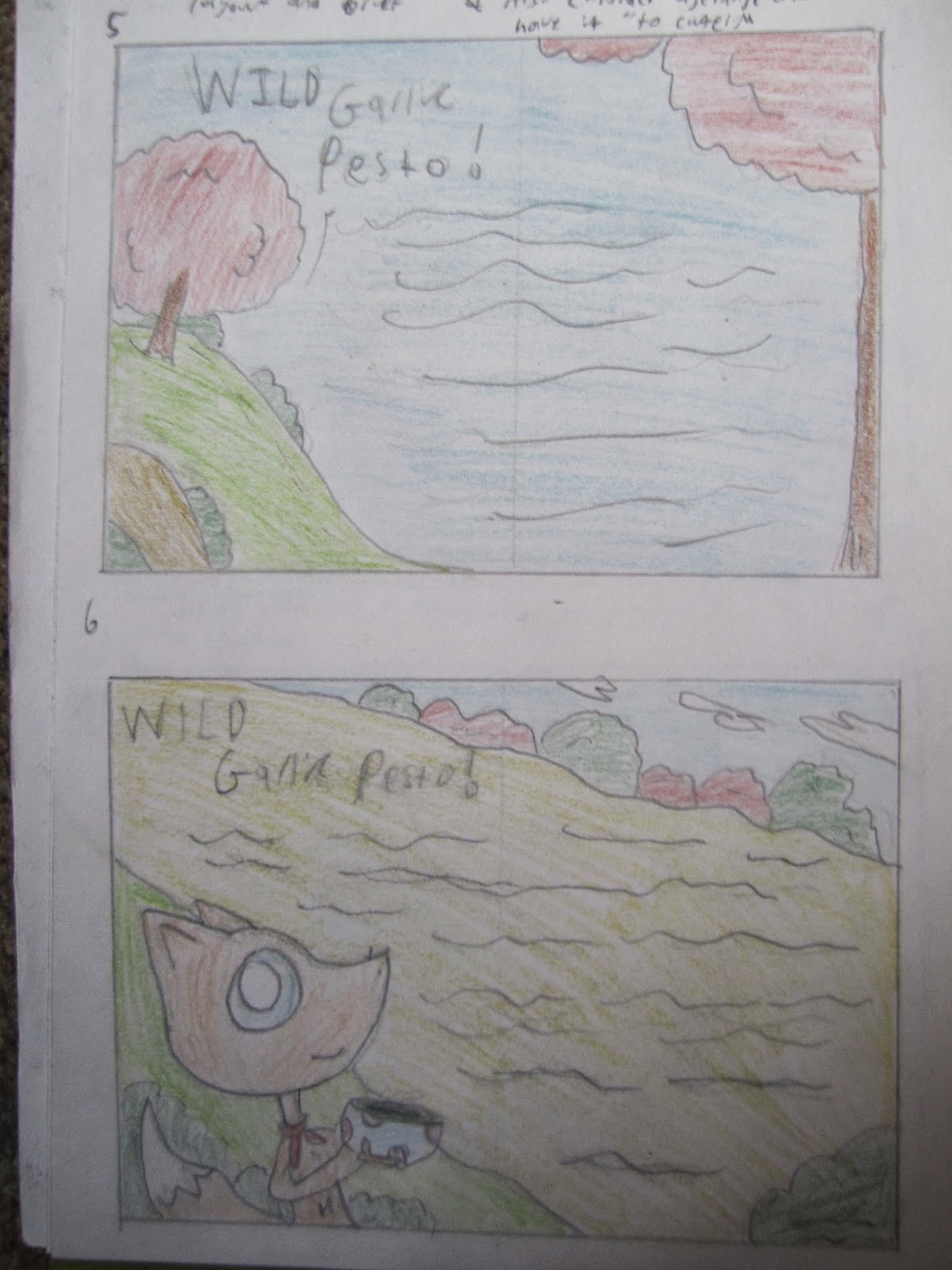
4 and 5: Two example designs for the Wild garlic presto. This recipe is mostly about finding and using the  ngredients rather than cooking them so I used a outdoor, woodland forest scenery that wraps around the text
6 and 7: Similar to 6 and 7, these layouts could be used for any recipe though they do benefit the wild garlic presto the most. These layouts use fewer illustrations and focus more on a structured layout.


Childrens picture book research


One was of encouraging children to get involved in cooking and baking is by creating cook books based around animated and illustrated characters as children will want to own and follow the book because there favioute character(s) are involved. The books more often than not blend real time photographs with illustrated characters, sometimes even using the technique of Rotoscope to include the characters into the photos.

I have been researching into these books because I would like to include illustrations in my work due to the fact that I’m single illustration.

 Cooking with Pooh is a children’s recipe book themed around popular Disney character Winnie the pooh and was popular enough to get a computer game release on the Nintendo Ds.
 Examples of other Disney themed cook books include “The princess and the frog, Tianas cookbook”
“Cooking with Mickey around the world”, “Ratatouille What’s cooking” and “Minnie N me cooking together”.


Dora and Diego Let’s cook is another great example of a children’s book that blends illustrations with photographs. Using both Dora and Diego also makes the book appeal to both male and female audiences.

 
Straying away from the more famous characters, even simple illustrations can capture and holds a children’s interest. “The everything Kids cookbook” focuses a lot more on the photographs in the book but does include some quirky little characters throughout the book. There are countless examples of similar themed/styled picture books


Thursday, 20 March 2014

20/03/14 Blog Task


Matthew Rutters Rough Concept comments.


(Work to be uploaded when home/early tomorrow as it needed to be photo/scanned)

For this task I came up with 8 concept ideas, two front covers, two for each recipe and 2 ideas concept designs that could work for any recipe. I’m single honors illustration so I wanted to include illustrations in my concepts. I designed a few characters for the book, making sure there gender friendly.

The first front cover ha floating illustrations placed in interesting locations with the text wrapped around them. The second is a meadow scenery stretching over the front, spine and back cover with a little fox character included.

The first and second soup designs are photos mixed with illustrations (think Charlie and Lola by Lauren child) mix and matching them to create dynamic illustrations.

The next recipe pages are the Wild garlic presto and concentrates on lush scenery backgrounds with nice colors and little photographic elements.

The last two are dynamic sloping and curving designs that could work for any recipe.

I looked at the work of Lauren child and how she mixes photographic elements with illustrational drawings.

I also looked into children’s picture books that use a lot of illustrations such as the “Disney cook book”, “Dora and Diego Lets cook” cooking with “Winnie the poo” and “The everything kids cookbook” that has a lot of spot illustrations


After looking at other peoples work I realize that I need to research a lot more into front covers and what makes a dynamic front cover. I also need to be carful that the illustrations don’t distract for the overall designs.

Monday, 10 March 2014


Cookery Home Task

Here is my illustrated recipe for the “Eggy cheesy bread”. My main issue with this task was that I am very ignorant in the field of cooking so I had to make something relatively easy (and even that I needed help with) so my choice was the “Eggy cheesy bread” which would serve only one person at best and It only took about 15-25 minutes to make (and eat). The only changed I would make is that the recipe says to add the salt and pepper after you stir, I feel it would be more effective to add them after so they mix in with the mixture.
Most of the ingredients were sourced from a market stalls in my town (Bromsgrove) that open every Saturday all beside the salt, pepper and chives which I was surprised to find were hard to come by.
The illustration it's self, for me is hit and miss. The photographs came out clear and crisp and I feel the theme I choose works well, however when I tried to use home font, the camera didn’t pick up the font correctly and I don’t own a scanner, so I had to use computer font, though that said, the font I choose works well and looks hand rendered. Lastly the layout needs some work and I feel the gap in the bottom right needs to be filled but I couldn’t think of anything relevant to fill it with. All in all I feel it turned out well for my first try
 
Edit: I just saw Hannah Wood's version and feel I have been put to shame. I will differently try a lot harder to produce something more professional for the main brief.

Friday, 7 March 2014


Visually intresting photos

When I heard about the main brief haveing photos included, I was at first put off, not only because camera shy but also because I felt it lacked creative interest and design. So I started to look at how illustrators make photos/films more fun using props, designs and lighting effects

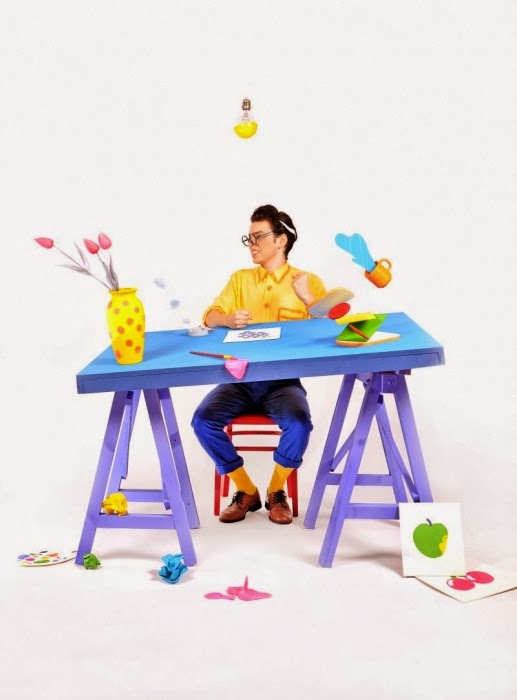
Lord Whitney is a collaboration of set design and prob artists between Amy Lord and Rebekah Whitney. They design interesting and imaginative sets and use the photos taken as the work of art. There sets are colourful, noticeable, original  and imaginative and they really know how to capture the creative eye. Although I would not be expected or allowed to go so over the top in my photos, using bright colours or fun sets should capture the viewer’s attention and brings a lot of fun and interest to the page.


A scanner darkly is an animated science fiction thriller based on a noval by Philip Dick. The film uses Rotoscope, drawings over real footage and creative the illustration of moving animation. I used Rotoscoping in college to create a short animated feature about a small animal visiting college.


Rotoscoping is another “out there” idea I could use for my cook book images. I could photograph me and then draw over myself and make a visually interesting set of photos.

Encouraging children to cook task
 
1) The Funky lunch book by Mark Northeast is a great example of encouraging children to enjoy making food. They can prepare cook foods in a fun way by creating lots of wacky designs. The book has nice large and clear examples of the food, presented in an exciting way. The text is easy to digest and clear on the page with a limited color pallet per page. Large verity of themes is also present so generating stories for each piece of food should be easy. The age range appears to be 4-8 due to the illustrations and format.
 
2) Garden superhero by Mihaela Lica Butler tales presents vegetables in a fun exciting way and encourages children for healthy eating. The pages have large illustrations in monochrome colors. This encourages the children to engage even more with the book by coloring in the illustrations. The book has a lot of book texts and the pages are not as engaging, for this reason the age range might be aimed a little higher then “The funky lunch book”
 
B)
1) Encouraging children to cook with cooking themed birthday parties, children can cook/make food with the help of an adult or supervisor and create an arrange of fun food to eat together.
2) Rising chefs cooking club/classes have an arrange of tasks and activates held to encourage children to cook/make food such as creating story time snacks that are based on food they are reading about, for example if the book was James and the giant peach the snack of choice would be peaches and peach related cooking activates.
 
 
3) Base fairy tails around healthy foods that will encourage children to enjoy them, for example green beans being magic beans. A well known example would green giant sweet corn advert. This encourages children to be like their favorite characters/stories/ fantasy’s.


Task 3: Sample design, double page spread of a childrens recipe.


For this task I first looked other example picture recipes and at how other illustrators had laid out there pages. Here is a few examples.


My double page spread was on the “Strawberry crown” Recipe. I picked this because it wasn't too short and wasn't to long and sounded like something I myself would enjoy making.
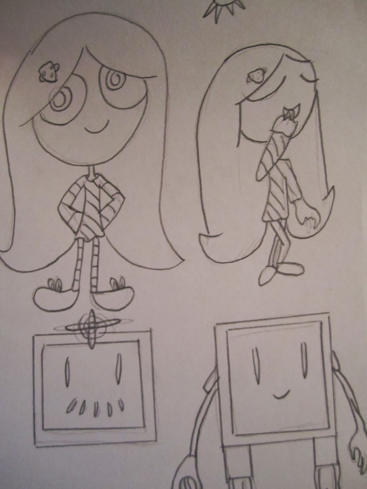
I designed two simple characters to go with the recipe sheet, a small girl and a floating robot (who would do the harmful tasks like cutting). The illustrations are simple and fun and do not distract from the text but instead help the child/children understand what to do.
 

The text may seem a little small but I usually draw by hand and then scan redraw it on the computer. So the text would be properly considered in size/readability when the piece is/would be redrawn.
This also applies to the colour. The colours are a little dim when done by hand but in the final I would use computer colours that would be brighter and leave the text more visible.


TASK 2 - Appropriate art style
 
 
Informative research title
 
The key word that springs to mind for me when thinking about informative research title's is accuracy when it comes to the illustrations/designs. This is not the correct place to use abstract or visual metaphors unless fully explained. The illustrations will naturally feflect on the subject matter and a realistic style would benefit here. At the time time however, if the illustrations are too boring and dry, the readers interest could be lost, so a good balance should be had.
 
Example
 
The Puffin Practical Books set is a set of short books teaching children a range of skills such as cooking, fixing a bike, creating things and social skills. All the illustrations are realistic yet colourfull and well designed.


Baby/Toddler
 
Illustrations for Baby/Toddlers should be more simple and less detailed so that the baby/Toddler can quickly identify the shapes/information that's meant to be delivered. The illustrations should also be large and clearly identifiable. That's not to say the illustrations should be of any less quality then other books and a level of illustratioal and graphical design skills still needs to be present when organizing a page. Visual metaphors and abstract illustrations should be avoided as the meanings will be lost to such a young age group.
 
Example
 
The Spot the Dog books by Eric Hill are a timeless collection of well thought out yet simple illustrations, teaching children shapes, colours and numbers (to name a few).
 
 
Picture book
 
Picture books for young ages and vary a lot in structure and style, there are many different examples of successful picture books that are very different to each other so i find identifying an exact "Correct" style challenging. In my view, the illustrations should reflect what ever the chosen theme of the book is and often or not is also reflected on what country the book is written/illustrated in.
 
Example
 
Eric Carle is known known famously for "The Hungry Caterpillar" book but he also wrote and illustrated a large verity of quality and imainative childrens books. My favourite being "The Bad Tempered Ladybird", a classic book with amazing and creative illustrations.
More children’s book illustrators/authors
Here is a few more children’s books that I enjoyed when I was a child or have discovered recently and inspire to.
Lauren Child


Jill Murphy

David mckee


 Helen oxenbury

 Lydia Monks
 
Alexis Deacon  


Oliver Jeffers