Sunday, 13 April 2014

Food art fun!


Well doing some research, I came across these fun fruit and veg designs, made to look like animals. Setting up food in this way is not uncommon and makes for some great and interesting photography work that’s bound to get children’s and adults attention. Unfortunately the brief is a little restrictive with the designs we can make, otherwise I would have enjoyed trying to make some animals or items out of food.

Here are two sets of examples and two websites full of fruit and food fun.


Friday, 11 April 2014

London book fair references


London book fair

On April 2014 we visited the London book fair as part of the course. This was an interesting experience and I found a lot of reference points for a lot of my subjects and even for my own personal style.


Here are some photos of interesting and/or relevant books I took during the visit.

Komit – Recipes books shaped like different ingredients or recipes that were featured in the book such as strawberries, cupcakes and a pumpkin. The cupcake one even included little metal balls on the cover. The inside of the books had the recipe written one side with a huge detailed picture of the item on the other.


Vemag NGV – Hello kittie cook books featuring different recipes mostly focusing on sweets and cakes. The style of my book will be very similar layout style of these books so I knew these would be a great reference point. Inside was a photo of the recipe with colofull illustrations often overlapping the photos.


Vemag NGV - Fun Food recipe books with a googly eyed cover. The book mostly featured cakes set up in a fun and imaginative manner.
 

Dag Veggie, Studenten Kochbuch – Food pops, a book full of vegetarian recipes that (oddly) were all about being on the end of a stick.
 

Dag Ultimative, Studenten Kochbuch – A stylish looking recipe book with a more sleek design. The style, colours and even the easy layout seemed to point more towards the male audience (though it was in German so I couldn’t read it)

Fun food for fussy little eaters, Unforuntly I dident write down the name of these publisher (doh!), however this was another fun little book with cleverly designed food to look like animals.

Thumbnails and plans


Thumbnails and plans

Here are photos of my development work so far, I have been waiting to use the scanner so I could properly upload these however I have been unable to get to one recently and so these photos will have to do for now (please excuse the poor quality)

I have been looking at the cookbooks with an illustrated element to them, often children’s recipe books that feature cartoon like characters and how those books set up there recipe pages. Here are some thumbnails and bigger coloured images of my drafts so far.

The finals will of course include photographs and I feel the photos combined with illustrations will present a very professional, fun and even quite unique look to them.

After a tutorial/Q and A with my tutor I plan on working more into these and then:

a)     Draw them on the computer

b)    Try out stock or sample photographs
 
The title I have chosen for the time being is "Woodland Wonders" however I have few other idea that I might go for such as "Eden recipes" and "Foxies treats".
 
Character sheet 1, designed the main illustrated characters
 
Character sheet 2, with character designs and front cover work

 
Recipes thumbnail list designs

 First front cover mockup design
 Close up of the cover for the first front cover mockup design

First recipe inside mock up for "Let's soup it up" recipe.


Sunday, 6 April 2014

E-books task


1:Living books

Although this is a very old example, I feel it is relative to the discussion at hand and I can vouch for it as it helped me learn what I was a child. Living book is a company that creates interactive children’s book in the form of a game and story. The group was founded in 1992 and is associated with the random house company and have worked to created 18 timeless books from Dr.Seuss to Author. The age range for all these stories are fairly young from about 2-6 years old, the older children will enjoy the fun interactive well the younger will simply enjoy the story and visuals.

I have read many of these books as a child so I have firsthand experience on how they work. On first load up, you can choose if the story is interactive or not. On selecting interactive, a scene will play and the page of the first story will be read, after which children can go to the next page by clicking the arrow icon but before then they can click of different things on the page/screen and interact with it (for example, clicking an owl might make it hoot and clicking the pound might make a fish jump out.)

They can also click on the words at the bottom of the page and they will be spoken out, this helps children read at their own pace and to hear the sound of the words as well as see them on the page. On Authors teacher trouble, one page is all about Authors spelling test, and the page shows a bunch of words on the page, clicking the word will not own make the word be sounded out but will also show a visual. This is an excellent way to learn for children and will help them remember the sounds and visuals a lot easier.

Although the books are all very old, these are a fantastic way of learning and I cannot think of any way they could be improved. Even if people argue the visuals could overpower the story, the story can be played without the visuals. The only downside I can think of is that the books are dated, so no touch screen elements are available making the books feel more like a game then a story.

 
2: Animated story book - lion king                                                             

Around the time of living book, Disney had their own similar company working on interactive books called “Disney interactive” that still works today to create console games hosted by Disney. The first book in their series was the lion king and the last was Mulan. The books came out around the same time as the films and because of the close tie in and popularity of Disney were highly successful and also appealed to a wide range of audiences, though there target would have been similar to living books of 2-6.

The books also ran in a similar fashion, telling the story on each page and then allowing the reader/player to interact with the elements on the page afterwards such as clicking on a character or background item and watching it move/speak or clicking on a word and hearing it be sounded out. The fact that the book are Disney helps to engage children even more as they learn to identify with the characters and if they have seen the movies, they know what should be happening in the scene which will help them understand the words.

Like the living books stories, you can choose to have the interaction turned off or on, having it off well simply go though the story with the only visuals being the ones before or during the story being read. This can help children focus more on the story. There are slightly more elements to these books then the living books stories, there are extra side games you can click on for each page and also an option similar to a dictionary that helps children understand the words. There isn’t much to penalise with the Disney books other then similar to living books they are quite old and so no touch screen elements are available.

 
3:Meet the insects encyclopaedia series

After looking at two older companies/series I decided to look at and compare them to a more modern series of e-books called “Meet the insects encyclopaedia series”. This is a series of Apps all about insects and is highly educational and involving. The app includes, touch screen elements such as changing pages and zooming in, photos and videos of the insects and stories and games featuring illustrated versions of the insects.

There are three apps in the series, all tackling different insects. The book is very educational and really does in depth about each insect, you can learn about their history/origin including how they move and what they eat and learn about each individual part of their body.

Due to the subject matter and the more advanced language used, the age range for these books would properly be late first school/middle school area of about 6-10, but even then adults and older children could still learn a lot about these factual apps/books.

The story elements in the app/books are not too long but six are included in each app/book and the visuals are interesting and subtle enough to keep children’s interest. The visuals in all the elements of the app are fantastic for learning, instead of one picture, children can see the whole of the insect in a range of different ways which really helps children to understand the facts they have read/digested. Due to the heavy and serious subject matter, children will properly not engage with the factual aspects unless motivated however the illustrate stories should provide enough stimulation for children of even a younger age.


Friday, 28 March 2014

Recipe Book Visual Research

Recipe Book research 27-28/03/14


Yesterday I went out and looked at some recipe books, looking for interestingly designed books or books that had an extra element to them, especially when the cover was involved.  Here a few that I found.


Made from scratch vegetarian
Love-Food
www.parragon.com/lovefood
 

This book got my attention with its 3D, scratch layered cover. All the dishes were vegetarian dishes and easy to make.

Harmlyn All colour cookbook
200 low fat dishes
Cara Hobday


A small little book with a very formal look about it and easy to carry around

The Australion womans weekly
The Bumper book of kids birthday cakes
Acp books


A large, bulky, hardback children’s books full of delightful little recipes. The inside pages were nicely designed with a photo/three dimensional element to them.

Donna Hay
No time to cook
Publisher Hardie Grant books


A charming and quite recipe book with a cut out designed front cover. The main colour was light blue and I felt calm just looking at it.

Nutella - 30 best recipes
Larousse
2011
By Jaequi Small


This was a partially strange but well designed book cut out in the shape of a Nutella bottle and contained recipes using Nutella.

Coca-Cola Cookbook
An Hachette Uk Company
2013 Octopus books


Even stranger then the Nutella book was the Coca-Cola cookbook which contained information about Coca-Cola and full recipes to do with Coca-Cola (which I’m still confused about)

Friday, 21 March 2014

20/03/14 Roughs


Here are my sketches from/for yesterdays sessions. The comments and feedback i received were overall positive and are written in the:

Matthew RuttersRough Concept comments Task below. The post a little late as i had to wait till I could Photograph my images.


1:A small set of character designs, I experimented with male and female genders so that  like the Dora and Diago cooking book the cook book would appeal to both genders.
2 and 3: Two front cover designs, one using floating spot illustrations and one using a full illustrated background. I wasent quite sure how to go about the front cover due to the E-book confusion, so more work and research has to be done for this section.
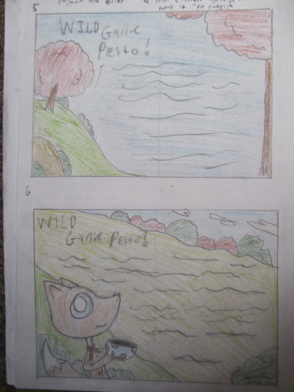
4 and 5: Two example designs for the Wild garlic presto. This recipe is mostly about finding and using the  ngredients rather than cooking them so I used a outdoor, woodland forest scenery that wraps around the text
6 and 7: Similar to 6 and 7, these layouts could be used for any recipe though they do benefit the wild garlic presto the most. These layouts use fewer illustrations and focus more on a structured layout.


Childrens picture book research


One was of encouraging children to get involved in cooking and baking is by creating cook books based around animated and illustrated characters as children will want to own and follow the book because there favioute character(s) are involved. The books more often than not blend real time photographs with illustrated characters, sometimes even using the technique of Rotoscope to include the characters into the photos.

I have been researching into these books because I would like to include illustrations in my work due to the fact that I’m single illustration.

 Cooking with Pooh is a children’s recipe book themed around popular Disney character Winnie the pooh and was popular enough to get a computer game release on the Nintendo Ds.
 Examples of other Disney themed cook books include “The princess and the frog, Tianas cookbook”
“Cooking with Mickey around the world”, “Ratatouille What’s cooking” and “Minnie N me cooking together”.


Dora and Diego Let’s cook is another great example of a children’s book that blends illustrations with photographs. Using both Dora and Diego also makes the book appeal to both male and female audiences.

 
Straying away from the more famous characters, even simple illustrations can capture and holds a children’s interest. “The everything Kids cookbook” focuses a lot more on the photographs in the book but does include some quirky little characters throughout the book. There are countless examples of similar themed/styled picture books


Thursday, 20 March 2014

20/03/14 Blog Task


Matthew Rutters Rough Concept comments.


(Work to be uploaded when home/early tomorrow as it needed to be photo/scanned)

For this task I came up with 8 concept ideas, two front covers, two for each recipe and 2 ideas concept designs that could work for any recipe. I’m single honors illustration so I wanted to include illustrations in my concepts. I designed a few characters for the book, making sure there gender friendly.

The first front cover ha floating illustrations placed in interesting locations with the text wrapped around them. The second is a meadow scenery stretching over the front, spine and back cover with a little fox character included.

The first and second soup designs are photos mixed with illustrations (think Charlie and Lola by Lauren child) mix and matching them to create dynamic illustrations.

The next recipe pages are the Wild garlic presto and concentrates on lush scenery backgrounds with nice colors and little photographic elements.

The last two are dynamic sloping and curving designs that could work for any recipe.

I looked at the work of Lauren child and how she mixes photographic elements with illustrational drawings.

I also looked into children’s picture books that use a lot of illustrations such as the “Disney cook book”, “Dora and Diego Lets cook” cooking with “Winnie the poo” and “The everything kids cookbook” that has a lot of spot illustrations


After looking at other peoples work I realize that I need to research a lot more into front covers and what makes a dynamic front cover. I also need to be carful that the illustrations don’t distract for the overall designs.

Monday, 10 March 2014


Cookery Home Task

Here is my illustrated recipe for the “Eggy cheesy bread”. My main issue with this task was that I am very ignorant in the field of cooking so I had to make something relatively easy (and even that I needed help with) so my choice was the “Eggy cheesy bread” which would serve only one person at best and It only took about 15-25 minutes to make (and eat). The only changed I would make is that the recipe says to add the salt and pepper after you stir, I feel it would be more effective to add them after so they mix in with the mixture.
Most of the ingredients were sourced from a market stalls in my town (Bromsgrove) that open every Saturday all beside the salt, pepper and chives which I was surprised to find were hard to come by.
The illustration it's self, for me is hit and miss. The photographs came out clear and crisp and I feel the theme I choose works well, however when I tried to use home font, the camera didn’t pick up the font correctly and I don’t own a scanner, so I had to use computer font, though that said, the font I choose works well and looks hand rendered. Lastly the layout needs some work and I feel the gap in the bottom right needs to be filled but I couldn’t think of anything relevant to fill it with. All in all I feel it turned out well for my first try
 
Edit: I just saw Hannah Wood's version and feel I have been put to shame. I will differently try a lot harder to produce something more professional for the main brief.

Friday, 7 March 2014


Visually intresting photos

When I heard about the main brief haveing photos included, I was at first put off, not only because camera shy but also because I felt it lacked creative interest and design. So I started to look at how illustrators make photos/films more fun using props, designs and lighting effects

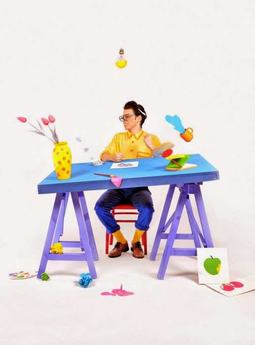
Lord Whitney is a collaboration of set design and prob artists between Amy Lord and Rebekah Whitney. They design interesting and imaginative sets and use the photos taken as the work of art. There sets are colourful, noticeable, original  and imaginative and they really know how to capture the creative eye. Although I would not be expected or allowed to go so over the top in my photos, using bright colours or fun sets should capture the viewer’s attention and brings a lot of fun and interest to the page.


A scanner darkly is an animated science fiction thriller based on a noval by Philip Dick. The film uses Rotoscope, drawings over real footage and creative the illustration of moving animation. I used Rotoscoping in college to create a short animated feature about a small animal visiting college.


Rotoscoping is another “out there” idea I could use for my cook book images. I could photograph me and then draw over myself and make a visually interesting set of photos.